Eric Appel and Charlie Ferrer Create 7 Vibrant Vignettes
A Dealer and a Designer Collaborate
Dealers and interior designers work closely together to achieve a common goal — to place the perfect design pieces in interiors. But it goes much further than that; there’s a sort of symbiotic relationship between them: they educate and inspire each other, exchange ideas and opinions, and ultimately, collaborate in making the best choices for the setting. Eric Appel, esteemed gallerist of his eponymous New York City storefront Eric Appel LLC and interior designer Charlie Ferrer of FERRER, got together to produce a series of vignettes that highlight pieces from Eric’s stellar inventory and showcase Charlie’s formidable design chops. What transpired was an exciting concert of talent, with Eric and Charlie inspiring and informing each other’s choices to create the stunning ensembles seen here. Eric and Charlie share their thoughts, musing on the pieces and the process.
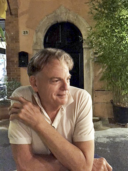 | 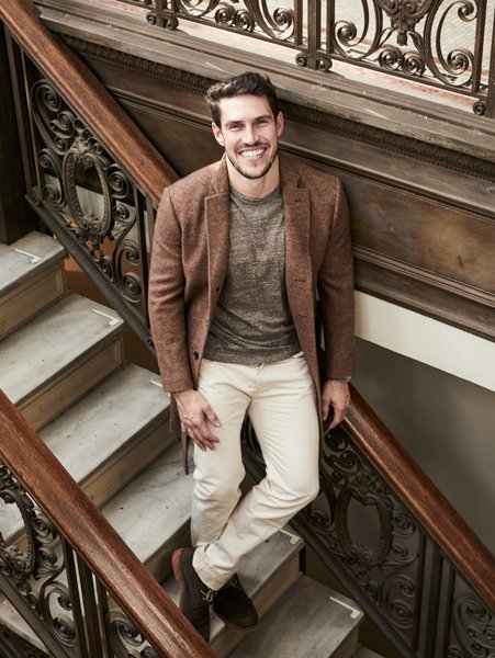 | |
| Eric Appel | Charlie Ferrer. Photo by Kenny Thomas. |
Q: When did you first meet, and how did you decide to work together on this project?
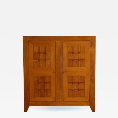
CHARLIE: My relationship with Eric actually began years ago when, as a fledgling designer, I very timidly began familiarizing myself with all of the best dealers in New York. Eric's gallery struck me as a notch above most. So much so that I was always a bit intimidated when visiting. He had this incredibly elegant Paolo Buffa cabinet that I desperately wanted to place but I never found the right client for it. Through my obsession with that piece, I came to know Eric more closely and realized he was, in fact, very approachable and friendly and open to sharing his knowledge. Ultimately, a Fontana Arte console for my parent's Greenwich home, which was then featured in Galerie, was one of my first important purchases from him.
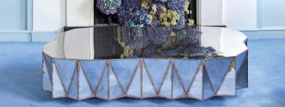
ERIC: The Fontana Arte blue mirrored console had just arrived in a shipment from Italy, and it was so charming I didn't want to part with it. I was happy that Charlie had selected it for the Greenwich project. It confirmed to me that he has a very good eye. The article in Galerie, I think, bonded our professional relationship and led us to this collaboration.
Q: Eric says there is no particular theme to the vignettes you collaborated on, but I wondered if you had a visual thread or if you were just creating beautiful tableaux.
CHARLIE: That’s correct, no particular theme governed our selection process. In most cases, we layered the setups and then edited them back down, stripping out pieces, embracing a less is more mindset. I think each vignette imparts some sense of a living environment, a moment in an imagined home. In that way, together, the vignettes cohere into an abstraction of an interiors story.
Q: How did you choose the objects?
CHARLIE: We started with a piece that we both agreed was strong as a focal point and then built up around it. Generally, when it comes to furniture and lighting, I obsess over materials, finish and construction details. In the images Eric and I created, each one is set apart by a special detail, material choice or finish quality.
ERIC: We riffed off each other suggesting one object, then seeing how it balanced with the other. It was a learning experience for each of us.
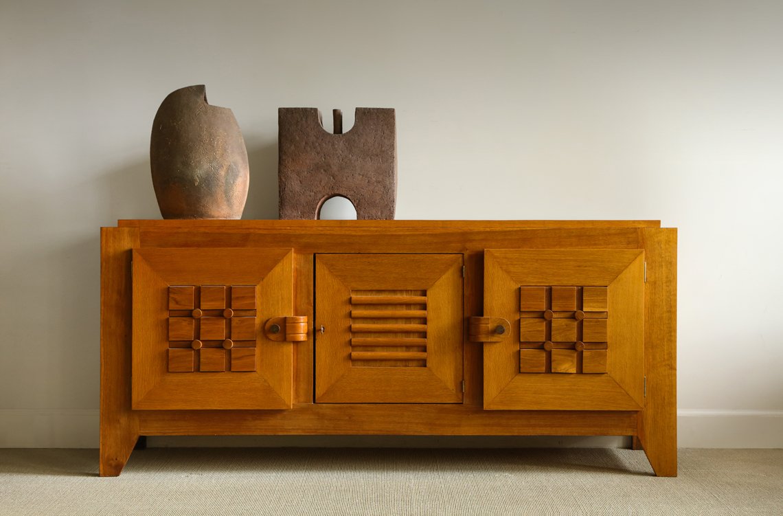 |
Brigette Tansini ceramic sculptures, Oise, France c. 1975. Large oak sculpted front sideboard attributed to Guillerme & Chambron, France c. 1950 W: 83.5"; D: 19.5"; H: 38". |
ERIC: This sideboard is one of the newer additions to the gallery, and I chose it because of Its strong geometric graphic presence. The ceramic sculptures complement the geometry of sideboard. CHARLIE: Juxtaposition of organic and geometric forms appeals to me, too. The cabinets and seating of Guillerme et Chambron are among my favorites. Their gutsy and idiosyncratic forms are uniquely appealing.
.jpg) |
Pair of armchairs by Francois Letourneur, France c. 1955. W: 29"; D: 35"; H: 33"; Arm: 21"; Seat: 15". Rare floor lamp by Angelo Lelli for Arredoluce model 12628, Italy c. 1950, with yellow and white Perspex shades encaged in black enameled steel rods, with brass fittings and marble base. H: 83" Diam: 17". Ceramic sculptural low table with round glass top and brass fittings, Italy c. 1950. Diam: 31.5"; H: 18" . |
ERIC: The Lelli floor lamp is one of my favorite pieces of lighting. It's playful and colorful, as is the ceramic low table. I am particularly drawn to Italian design of this period. CHARLIE: Color is proud in this composition. The pieces are unlike each other in most respects, but similar in their bold use of color.
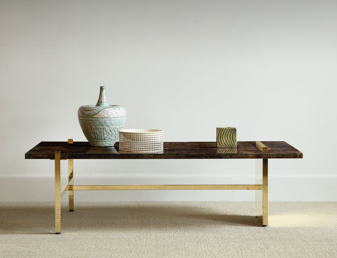 |
Reconfigured Aldo Tura top, Italy c. 1950 with contemporary three-legged base in polished bronze by Appel Modern. W: 51"; D: 26"; H: 15". Large Guido Gambone vase c. 1950. Small square vase by Fantone, Italy c. 1950. Pierced metal dish by Joseph Hoffman c. 1970 . |
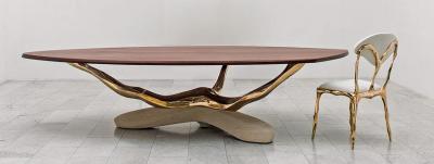
ERIC: I designed the low table by combining a 1950s Aldo Tura lacquered parchment top with a bronze base of my own design. Tura produced some beautiful parchment pieces in the 50s, but the bases were not always so desirable. The three-legged table is based on the ancient Greek tables that had three legs, because they were more stable than a four-legged table. This is something I learned from studying some of Robsjohn-Gibbings’s tables. CHARLIE: There is a particular luxuriousness to the range of textures that appear in this vignette. I like the choices Eric made in adapting the original Tura top.
_0.jpg) |
| Sculptural sofa by Xavier Mariscal, Spain c. 1980. W: 100”; D: 44”; H: 33”. Early Stilnovo floor lamp in cream with three lights, Italy c. 1950. H: 74.5”; Base Diam: 9.5”. Thonet black lacquer stool/table, USA c. 1950. Diam: 13”; H: 14” . |
ERIC: The Mariscal couch was designed in 1980 by Xavier Mariscal, a Spanish architect — a very unusual and sensual form. The curving leather back invites the sitter to recline and relax on it. The straight lines of the the other objects juxtapose the softness of the sofa. CHARLIE: The Mariscal sofa looks like the creation of an architect. In its sculptural lines and imposing scale, I see discipline and adventurousness.
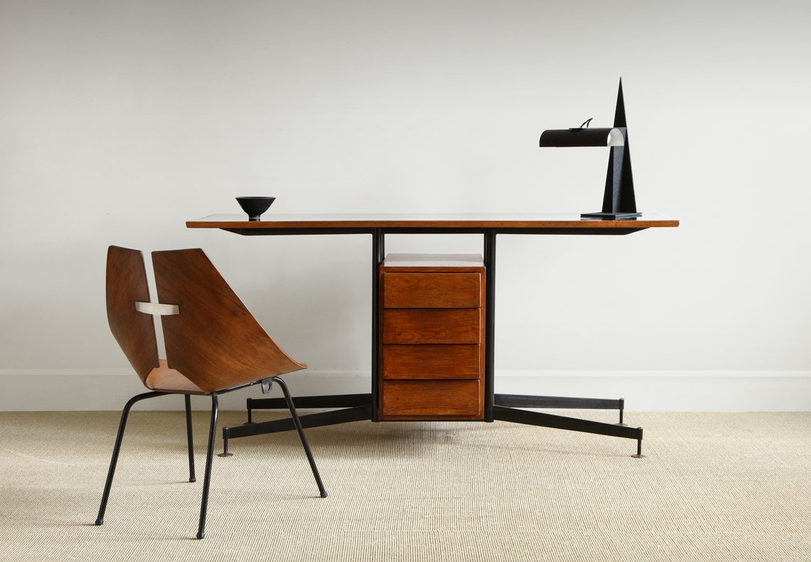 |
Partners desk in the manner of Ignazio Gardella, Italy c. 1955. Oak with black composition top, black enamel legs and brass fittings. W: 63"; D: 23.5"; H: 30". Molded walnut side chair by Ray Komai for George Jensen, USA c. 1960. W: 21" D: 21"; H: 29"; Seat: 15". Aleksandr Rodchenko steel desk table lamp for Arteluce, Italy c. 1973. W: 11”; D: 14”; H: 19”. Rostrand black ceramic bowl, Sweden c. 1950. Diam: 6”; H: 3”. |
ERIC: These object are more formal, utilitarian — almost mechanical in their purpose. I feel this is a handsome grouping. CHARLIE: I think Eric nailed it. The construction details of the desk, chair and lamp all speak to rigor of design. I imagine someone like Tom Kundig favoring this group.
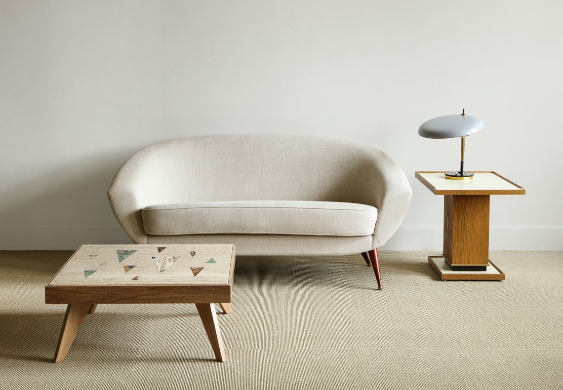 |
| "Tellus" sofa by Folke Jansson, Sweden c. 1950. W: 64"; D: 31"; H: 29"; Seat: 18"; Arm: 21". Low travertine table with inlaid hardstone and cerused oak frame by Richard Blow for Montici, USA c. 1950. W: 28.5”; D: 28.5”; H: 13”. Cerused oak side table with parchment top by Appel Modern. W: 18"; D: 25"; H: 21". Oscar Torlasco desk lamp with lens, Italy c. 1950. Diam: 14.5”; H: 15.5”. |
ERIC: This shot is a clean, simple combination of forms. I am especially fond of the Blow table with its colorful inlay of triangular forms. CHARLIE: I love everything about this image. It evokes a clean, optimistic aesthetic, and it reminds me of my old apartment.
.jpg) |
Martin Eisler & Carlo Hauner chair with metal base and Palisander armrests, Brazil c. 1955. W: 31"; D: 41"; H: 36.5"; 12" Seat. Ceramic black and white design low table by Cloutier, France c. 1960. H: 17”; W: 36”; D: 18”. Floor lamp with tole shade by Angelo Lelli for Arredoluce, Italy c. 1950. W: 13.5"; H: 54" (adjustable). Large textured vase, France c. 1940. |
ERIC: The Eisler chair is a recent and important acquisition along with the Lelli floor lamp. The black and white patterning on the Cloutier ceramic low table makes a strong, compelling statement to me. CHARLIE: Here, the sinuous lines of the chair and lamp, and the organic texture of the table top and vessel soften the rectilinear structure of the table. The colors are great as well.
Q: Do you have a favorite?
CHARLIE: My favorite image is the vignette anchored by the Xavier Mariscal sofa. I find it quite sexy with an 80s vibe that resonates.
ERIC: For me it is hard to select a favorite. They are all strong, balanced and harmonious. The oak sideboard combined with the Brigette Tansini ceramics was the first and I think the boldest, although I also like Charlie’s choice. That one does have a strong 80s sculptural vibe!
Q: How would you mix these objects into an existing interior?
CHARLIE: I look to create interesting tension among vintage, period and contemporary styles. All of Eric's pieces are so strong individually, mixing them into an interior is not difficult. Some are more bold than others. But none are too precious. And all are quite elegant in their own respect.
Q: What are you currently working on?
CHARLIE: I am about to complete a 1912 beach house in Watch Hill, Rhode Island and a cottage in Malibu. I’m in the early stages of a ground-up project in Southampton for which Joel Barkley of Ike Kligerman Barkley is the architect — super exciting. As well, I’m doing a special little penthouse uptown for a friend.
ERIC: The acquisition of new inventory for the gallery is my primary focus, and something I love to do. The hunt, the anticipation, and the feeling I get when I find something uniquely beautiful — my heart skips a beat! I look for the things people need, of course, but within those categories, I look for pieces that have a soul, that speak to me. And, I'm continuing to work on creating new design pieces for the gallery, for which my education in industrial design at Pratt has proved to be valuable because it taught me to visualize and design in 3D. I'm also looking to take on the work of new and fresh contemporary designers, to represent them at the gallery.
VIEW ERIC APPEL’S LISTINGS ON INCOLLECT


