RAMSA’s Randy Correll and Lauren Kruegel Siroky Create Incollect Fantasy Rooms
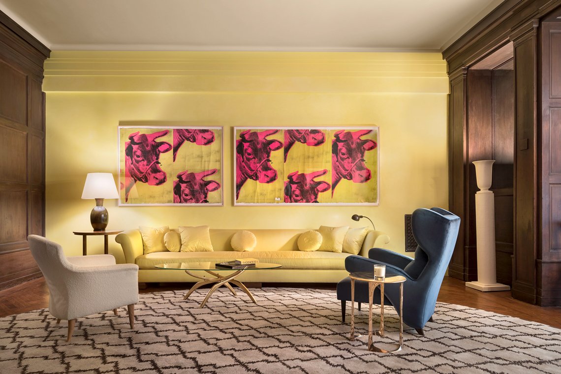 |
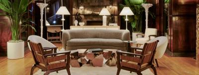
| RAMSA’s 2017 Kips Bay Decorator Showhouse by Lauren Kruegel Siroky and Ross Alexander. Milan’s Villa Necchi Campampiglio, designed by Italian architect Piero Portaluppi, and celebrated in the 2009 film I Am Love, provided inspiration for their living room. |
Incollect invited the esteemed and greatly talented duo of architect Randy Correll, partner, and Lauren Kruegel Siroky, Interiors Design Director and Associate from Robert A.M. Stern Architects (RAMSA) to engage in a bit of fantasy. We asked them each to create a room inspired by whatever caught their eye from the offerings on Incollect. Unfettered by such mundane considerations as budget, logistics or client approval, where did their imaginations lead them? Read on to discover how their rooms reflect both their early and recent inspirations, their approach to creating their rooms, and their personal favorites from their own and each other’s selections.
Randy Correll is responsible for the design of elegant residences across North America, from East Hampton and Martha’s Vineyard to Los Angeles, from the Midwest and Canada to the Caribbean. His process of working collaboratively with clients and his gentle ability to translate the firm’s tradition of meticulous planning and sophistication of details to meet his clients’ desires have brought him a loyal following. Many clients have commissioned Randy to design both their country houses and their city apartments, and his services often extend to the second generation of those clients.
 |  | |
| Left: Randy Correll, RAMSA. Right: Lauren Kruegel Siroky, RAMSA. Photos by Peter Aaron. | ||
Lauren Kruegel Siroky has served as design lead and project manager for high end projects across the United States and internationally. In New York City, her work includes the Park Avenue offices for the investment firm Angelo, Gordon & Co.; an apartment tower renovation on Madison Avenue; an apartment tower lobby renovation on Fifth Avenue; and a new multifamily residential building in West Soho. She recently completed the interior design of an award-winning multifamily residential building in Washington, D.C., and Stephen A. Schwarzman College at Tsinghua University in Beijing.
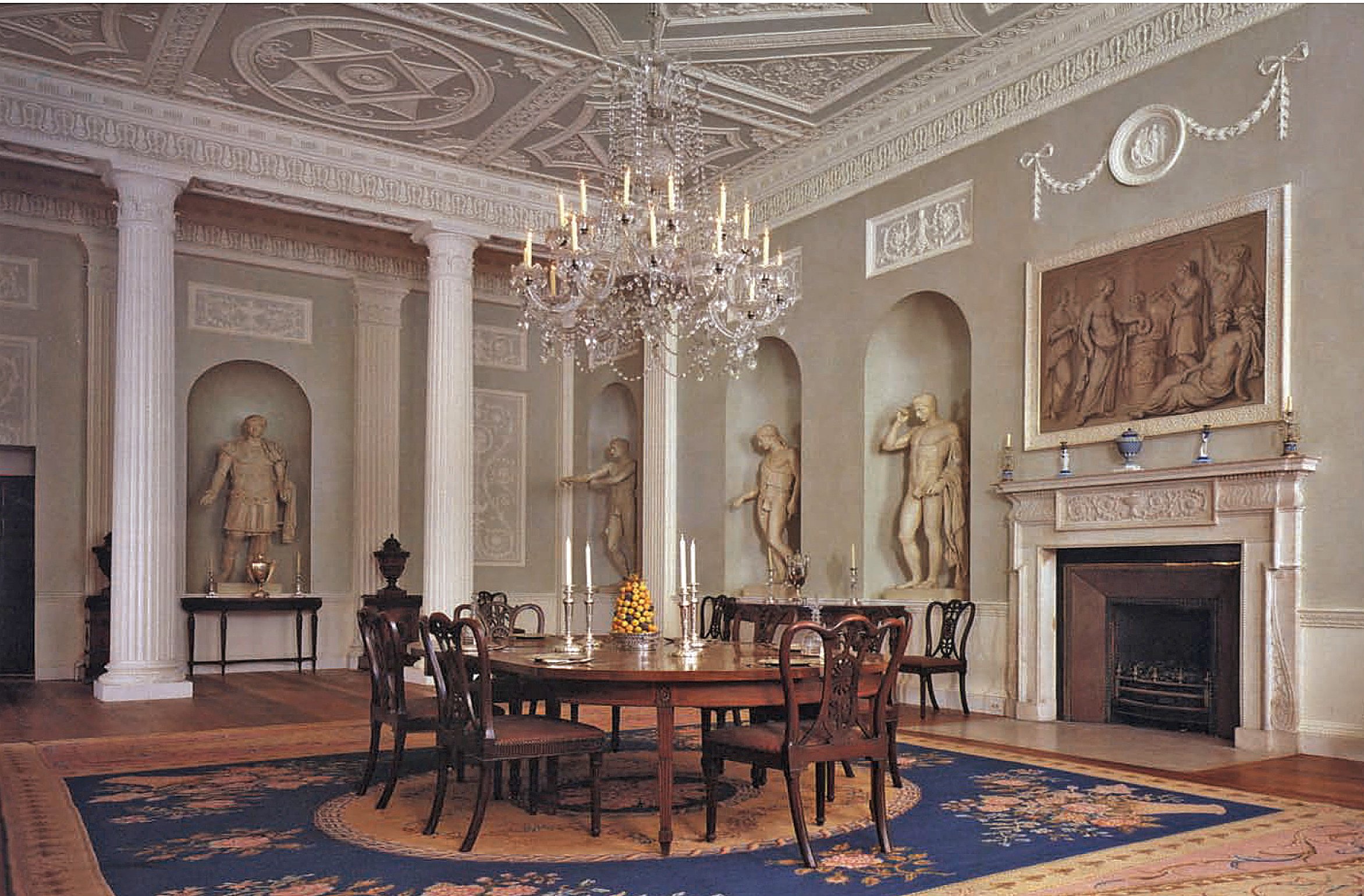 | |
| Lauren's earliest inspiration: The Lansdowne Dining Room, Metropolitan Museum of Art. Photo by Karin L. Willis |
Do you remember the first interior that made an impression on you?
Randy: A house that Bill Diamond decorated in Westchester County published in House and Garden in the 1980s. I still have the clippings in my file. It had a wonderful all-American feel with an infusion of color.
Lauren: The Period Rooms at the Metropolitan Museum of Art. I remember seeing them for the first time as a child, and spending hours searching for the one specific thing that made it so special. I could never find it...and the mystery of how each element enhanced the others was truly inspiring.
What have you seen, or where have you been recently that might inspire future designs?
Randy: This fall I went on a garden tour on Mt. Desert Island. We visited the Rockefellers’ garden in Seal Harbor. The door to their “playhouse” was open so I wandered in. I loved the rustic‐chic of the interior. The wood paneled walls and beamed ceiling of the main space were all painted a faded green, one of my favorite colors. The geometric paneling and locker doors in the entry were painted cadet blue framed in golden yellow.
 | 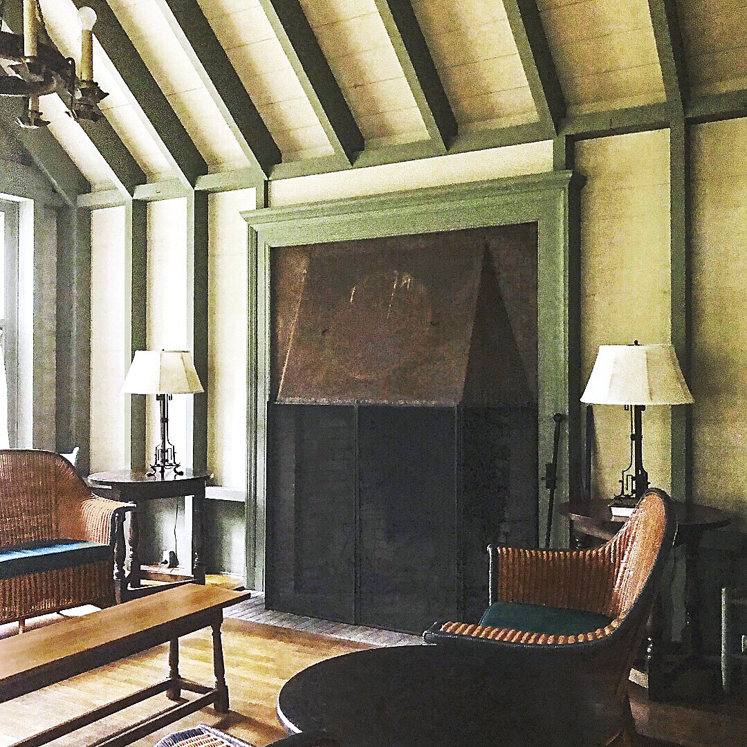 | |
| Left: Entry in the Rockefeller "playhouse," Seal Harbor, Maine Right: An interior of the Rockefeller "playhouse" inspired Randy's Incollect loggia room. Photos by Randy Correll. | ||
Lauren: I just returned from Prague...the layering of patterns and elaborate door hardware were incredible to see. I also loved that nothing was too mundane for some gesture of ornamentation — sidewalks, for example.
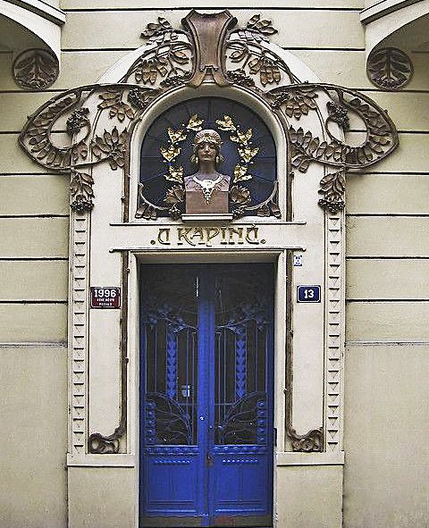 |  | |
| Left: During a recent trip to Prague, Lauren was captivated by ornamentation and patterning such as this. | ||
Is there a RAMSA aesthetic or philosophy that serves as a touchstone for your work?
Randy: We do many different types of projects for clients with widely divergent tastes. We try to key in on our client’s point of view and build on that, overlaying our aesthetic as appropriate.
Lauren: To Randy’s point, we are fortunate to cover such a variety of project types and styles — it is always a treat to explore a new perspective. I would say that the common thread is offering something that withstands the test of time.
Speaking only of decor, what is the one thing that every room needs?
Randy: Good lighting.
Lauren: Scale.
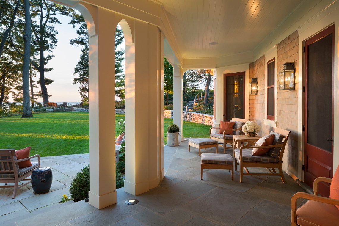 |
| A lakeside porch designed by Randy Correll, RAMSA. Photo by Peter Aaron. |
What was the narrative you created for your Incollect room? Did you imagine certain occupants, lifestyle or location?
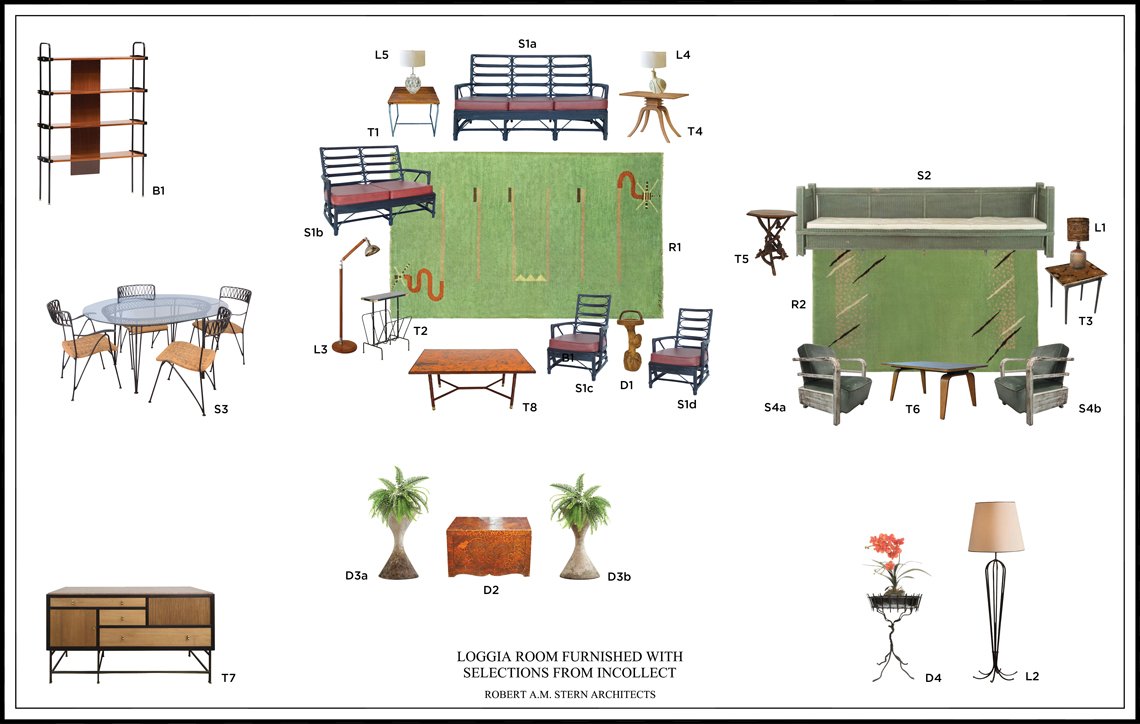
Randy: I am working on new house in Upstate New York that has a large loggia looking out at a lake. I imagined how I might furnish the space if it were mine.
 |
| Click here to view details on Randy Correll's Incollect picks. |
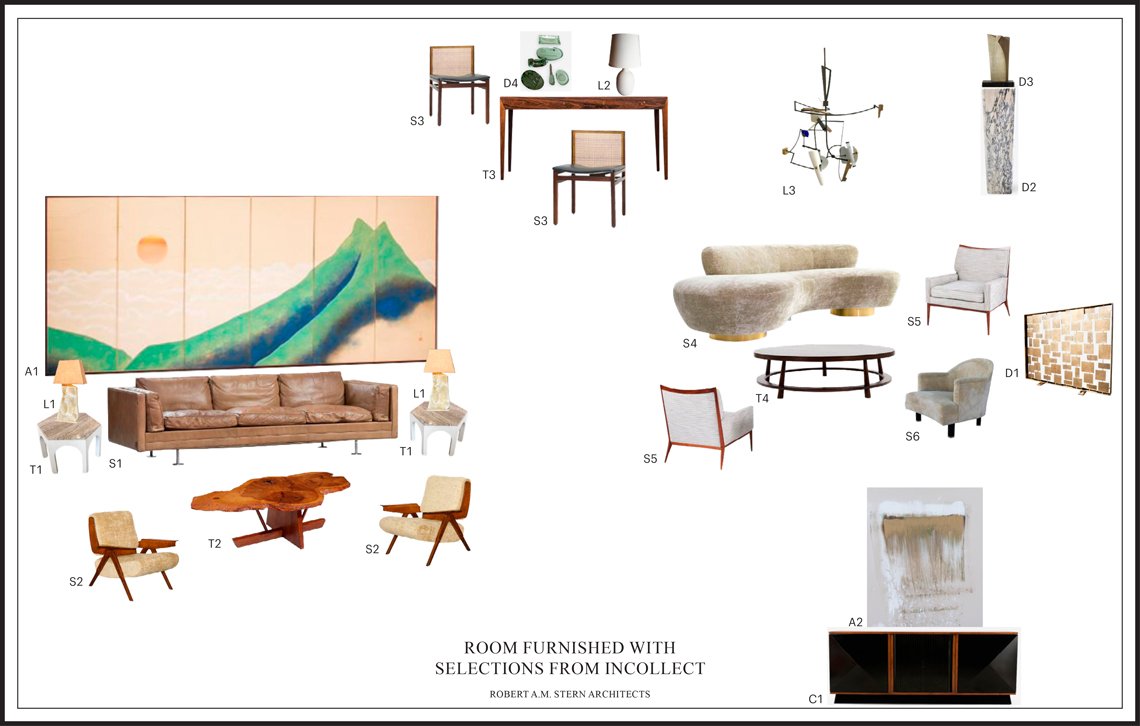
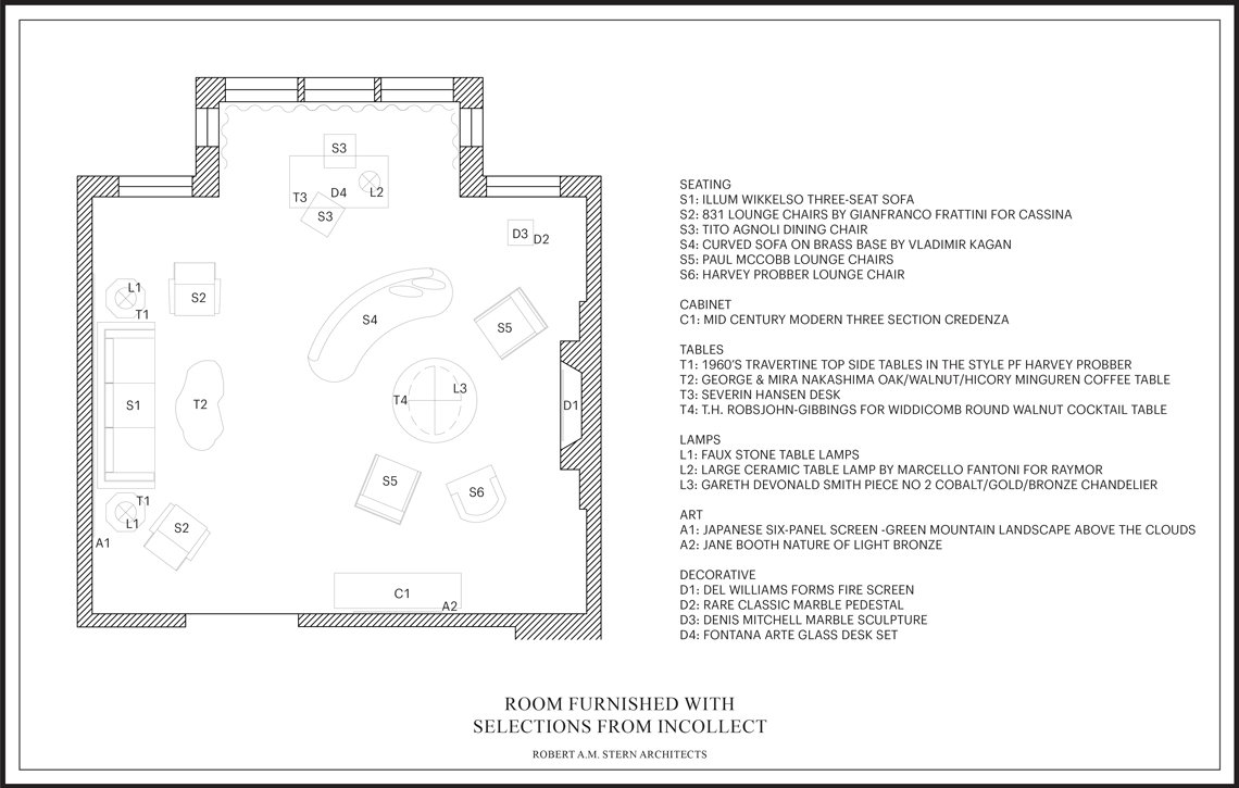
Lauren: I imagined a modern professional who likes to entertain, and who, like most New Yorkers, only has one entertainment space. I wanted to give a variety of conversational areas and light/moveable chairs for versatility. Most importantly, I selected pieces that don’t feel too “precious” — things you can put your feet on.
 |
| Click here to view details on Lauren Kruegel Siroky's Incollect picks. |
 | |
| 1940s Heywood-Wakefield maple lounge chair offered by Assemblage Ltd., available on Incollect |
How did you select the furnishings for your room — did you start with a large selection and edit from there or choose major pieces and build up from those?
Randy: I started with a Heywood-Wakefield furniture set and built the collection around that. I love Heywood-Wakefield furniture, from their early Victorian wicker to their modern blond furniture, which I have used throughout my house in Florida.
Lauren: There were so many great pieces, in all different styles — I couldn’t decide on anything! Finally, I found a fabulous Japanese screen that inspired me to revisit midcentury design. From there, I just wanted to select pieces that were fun and playful.
Which object from your room would you most like to take home, and which from the other room?
Randy: One of the Doris Leslie Blau rugs would make me very happy. The Agnoli dining chairs that Lauren chose would work perfectly in my apartment.
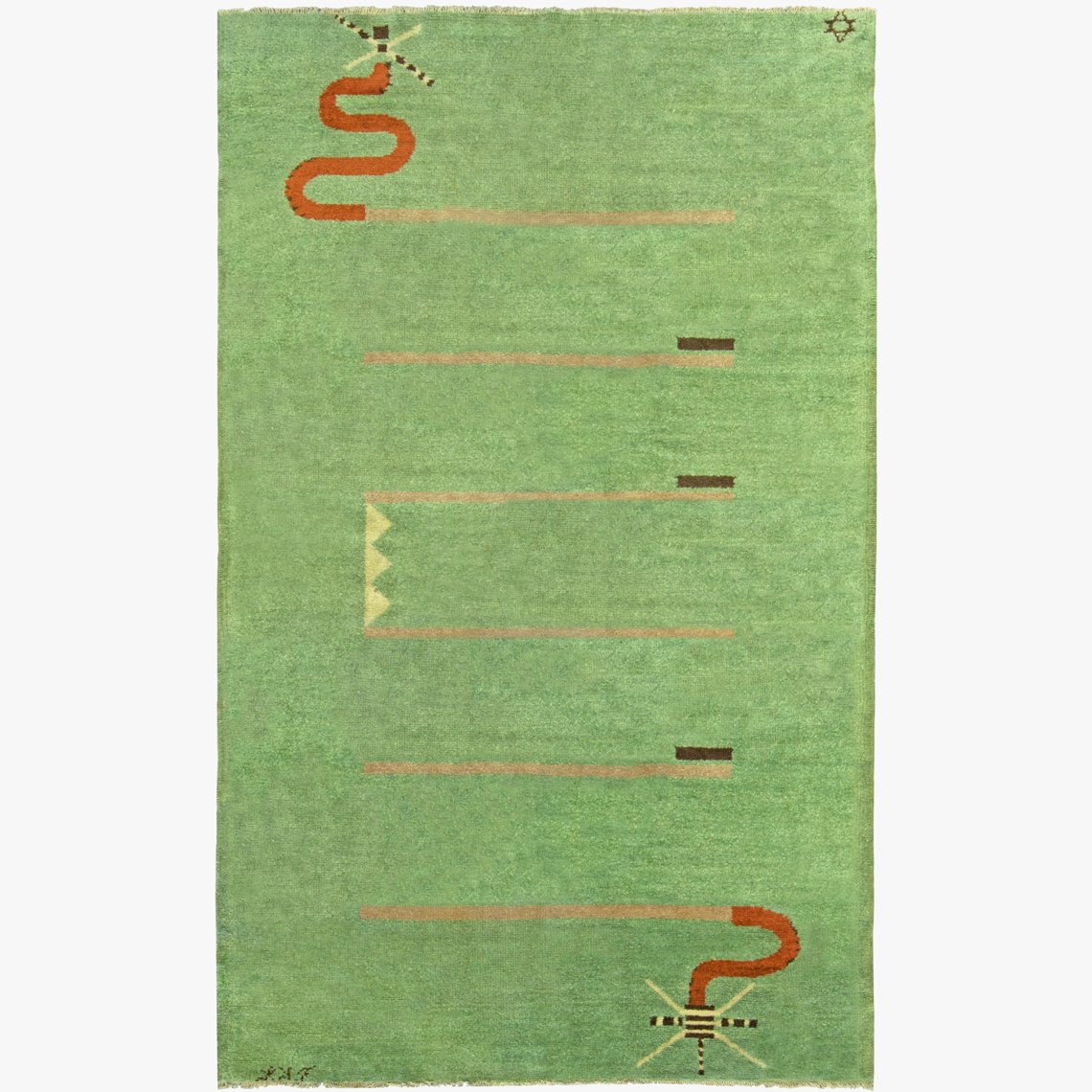 | 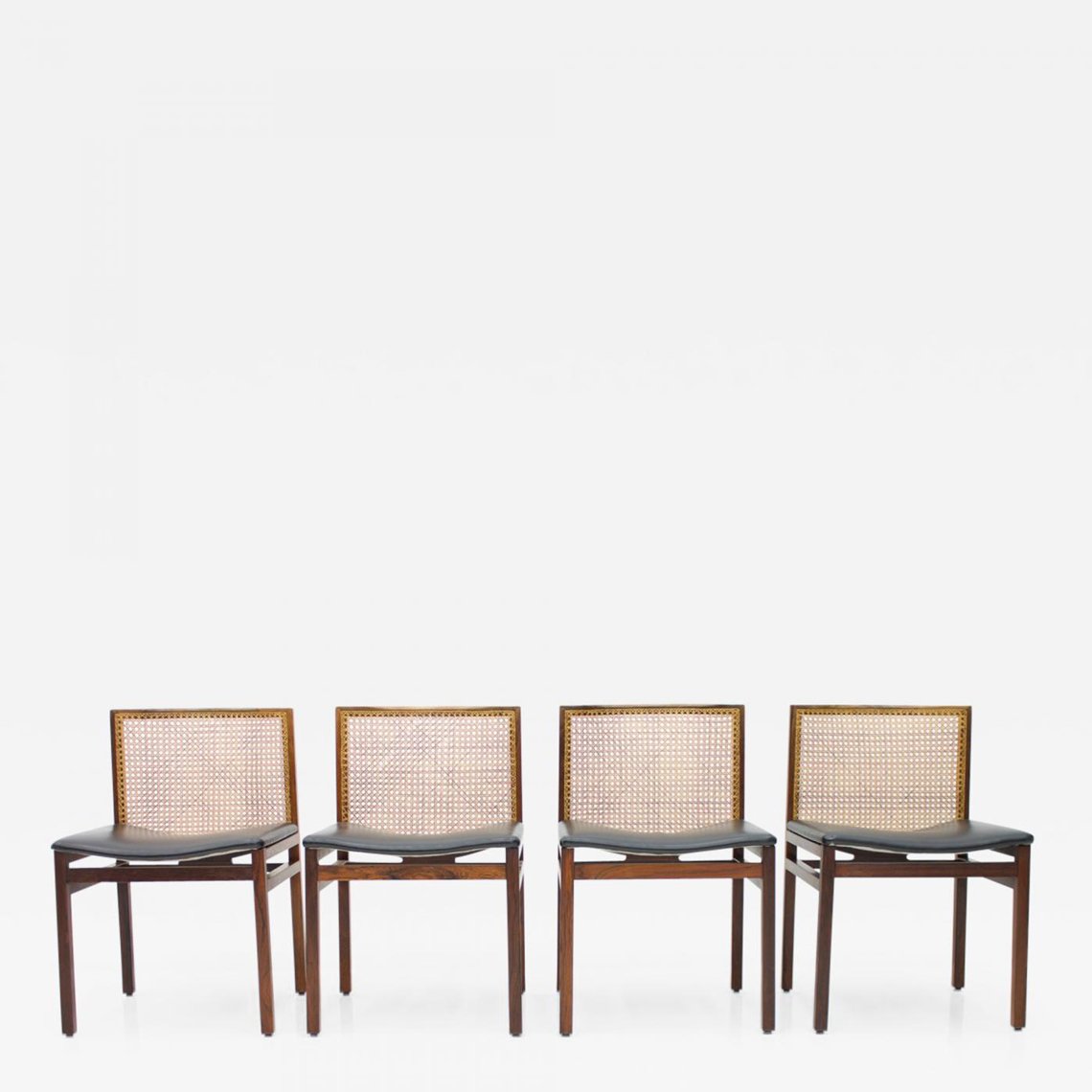 | |
| Left: Vintage French Deco rug from Doris Leslie Blau. Right: Tito Agnoli dining chairs from Inside Room. | ||
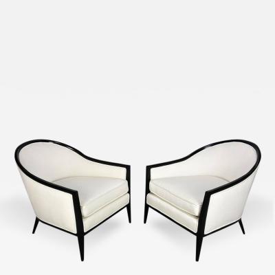
Lauren: I would take home the pair of Paul McCobb lounge chairs — always wanted them! And I would take home Randy’s Jacques Adnet magazine rack, or the post modern wooden architectural lamp.
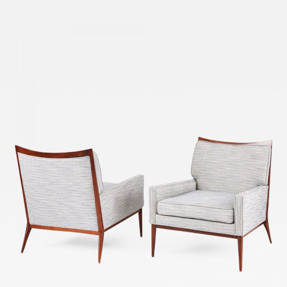 |  | |
| Left: Paul McCobb lounge chairs from Interior Motives. Right: Jacques Adnet magazine rack from Orange Los Angeles. | ||
Lauren's room has a very sleek, urban, international vibe and Randy's has strong elements of whimsy, with rustic and folk pieces — very, very different. Coincidental or planned?
Randy: I think of Lauren as more of a city girl, and I style myself as more of a country boy, having grown up in rural Ohio.
Lauren: Coincidental!
|
| Click here to view details on Lauren Kruegel Siroky's Incollect picks. |
|
| Click here to view details on Randy Correll's Incollect picks. |
Can you comment on each other's room; what stands out most?
Randy: I love the materiality of Lauren’s selections; metal, wood, stone.
Lauren: Randy has the incredible ability to make things feel like they’ve always been there, with true intention and purpose. I love that the pieces he selected feel as though they have been carefully collected over time.
What are your residential clients asking for in their homes?
Randy: Easy luxury and warmth. By easy, I mean that it can be a mix of ideas and “things,” provenance isn’t a requirement. Warmth and comfort are required.
Lauren: Low maintenance! Look but don’t touch is a bit passé these days.
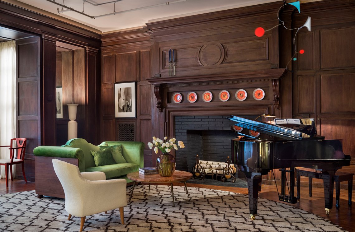 |
| Another view from RAMSA’s 2017 Kips Bay Decorator Showhouse by Lauren Kruegel and Ross Alexander. The white lounge chair is vintage Kerstin Hörlin-Holmquist; its spare lines contrasted by a small settee with lush curves and verdant green velvet upholstery. Behind the settee, a 1930s torchère is one of a pair, attributed to Louis Süe. The andirons are by Gilbert Poillerat; a set of plates by Gio Ponti for Richard Ginori line the mantle. Above the grand piano is a mobile by kinetic artist Marco Mahler. |
What is the biggest change you've noticed, or challenge you face, adapting interiors to current desires and expectations?
Randy: The desire to be modern, mid‐century, or otherwise. I’ve always been an old soul at heart, even when I was young. That being said, Lauren and I worked together on a large Manhattan office interior a few years back, which is definitely modern, so I can step up to the plate when required.
Lauren: It’s an interesting time because good design has become quite accessible. There is a new layer of resources for things — and at a new price point. Understanding the relative “value” that each client places on aesthetic vs. provenance is more complex now.
What projects are you working on now, and what's in the pipeline?
Randy: I’m working on houses in Upstate New York, the North Shore of Chicago, and in North Palm Beach.
Lauren: I am working on private residences in New Jersey, Florida, and Berlin, a corporate headquarter in Beijing, and a few multi‐family residential buildings in New York. I will begin new work in Hong Kong later this year.
VIEW MORE PROJECTS BY ROBERT A.M. STERN ARCHITECTS ON INCOLLECT


