Established & Sons Presents Astonishing Limited-Edition Designs From Zaha Hadid, Barber Osgerby, Amanda Levete & More
.jpg) |
The Limited Edition collection from Established and Sons partners with visionary designers to produce exploratory, forward-thinking pieces. Zaha Hadid Architects, who designed the Aqua Table pictured above, was one of the studio’s first designer collaborations. |
T
hrough its restricted-run series “Limited Edition,” Established and Sons encourages designers to create imaginative, finely crafted, and technically innovative objects that contribute to the joint futures of art and design. Limited Edition invites some of the world’s most talented designers to think beyond the boundaries of mass production and bring to life their most ambitious visions. The atelier enlists skilled artisan manufacturers to hand-apply special techniques and assemble delicate materials requisitioned by the designers, realizing an impressive furniture line that can only be produced by hand. Many pieces have been acquired by prominent European museums and galleries, and one of the London-based studio's first releases, the Aqua Table from Zaha Hadid, broke a record at auction.
Co-founder and creative director Sebastian Wrong helped launch Established and Sons after making a name for himself as a successful industrial designer. For Wrong, Limited Edition designs allow artists to escape from the limitations of the marketplace. “Curating the new Limited Edition pieces has been an instinctual and liberating process,” says Wrong. “The design market today is so homogenized, diluted, and risk averse. It’s heavily manipulated and monopolized by commercial demands. The opportunity to present a body of work like this for Established & Sons is a real pleasure because we’re free from those commercial constraints.”
Limited Edition's catalogue spans over 70 pieces from 18 leading contemporary designers. Below, Incollect introduces six significant designs by Hadid, Barber Osgerby, Committee, Terence Woodgate, Amanda Levete, and Liselotte Watkins.
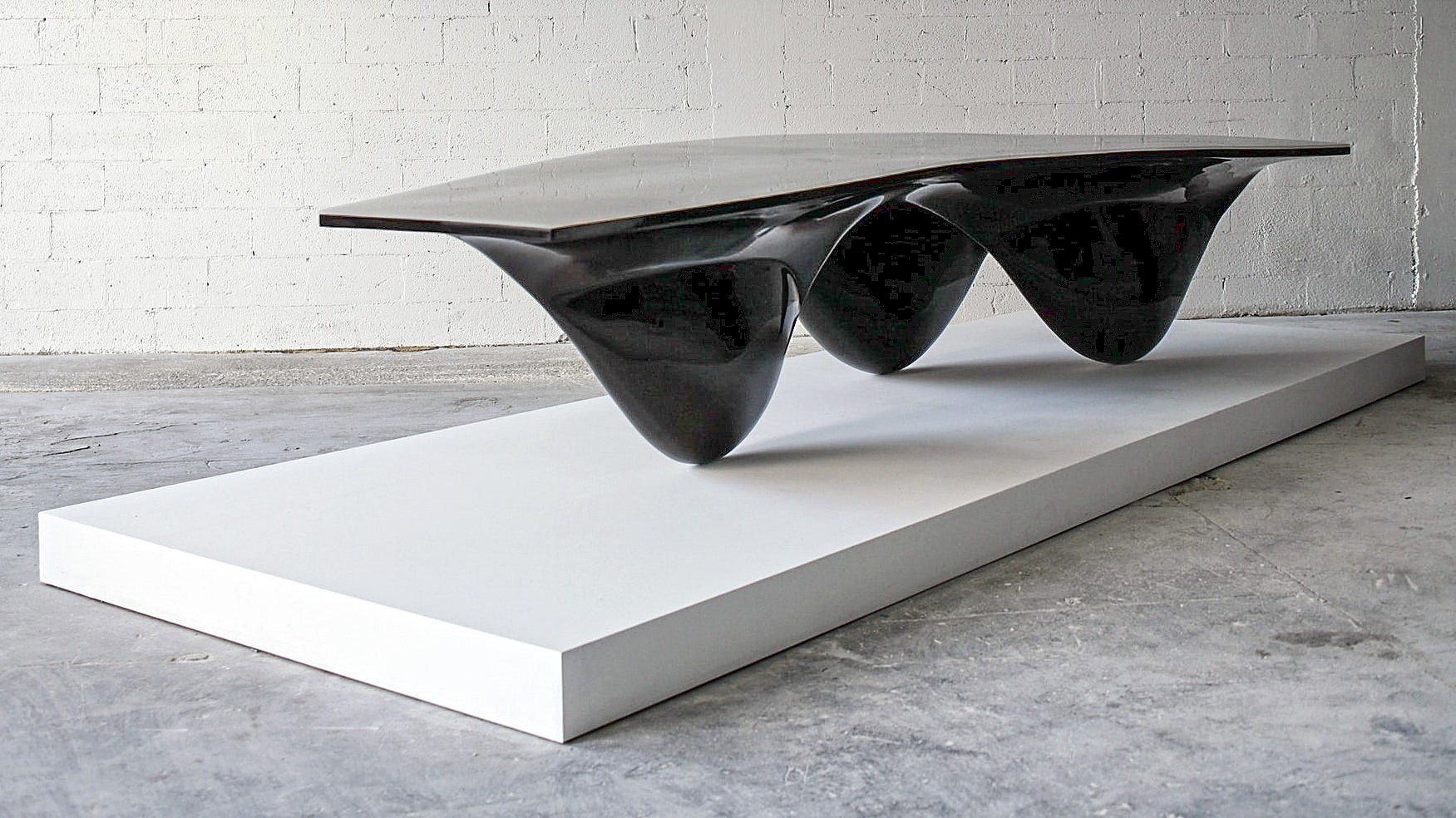 |
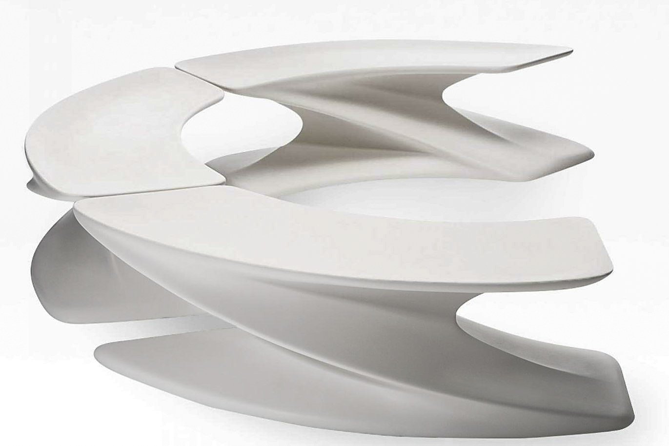
The Aqua Table from Zaha Hadid Architects has a fluid quality reminiscent of flowing water. |
Released in 2005, the Aqua Table from Zaha Hadid Architects experiments with fluidity and asymmetry. Three irregular swells protrude across the base of the table and flow together as a single form. This unusual three-legged base produces indents in the table’s sloping surface. As light refracts across the tabletop, shadow pools in its recesses, amplifying the sense of movement inherent to the design. Hadid and her design partner, Patrik Schumacher, selected a reflective lacquer paint originally designed for cars to finish the table. After applying eight coats of paint, the technicians polish the piece by hand to enhance its reflectivity. In the larger sized table, the top features a layer of silicone gel resembling pooled water.
Wrong notes that Hadid’s table was one of the first pieces that the gallery released. For him, the table’s reception revealed that consumers connect with unconventional luxury objects — especially when the designers have name recognition. “At first, people thought we were crazy,” he says of launching a three-legged table. “However, we sold three in two days, and the prototype sold for $296,000 in New York the following year, which was an auction record for a piece of contemporary design at the time.”
The angle of light affects the appearance of the Aqua Table. Bottom, left: A lacquered black Aqua Table with a white silicone gel top. Bottom, right: This Aqua Table with a turquoise silicone gel surface was designed as a run of 12. |
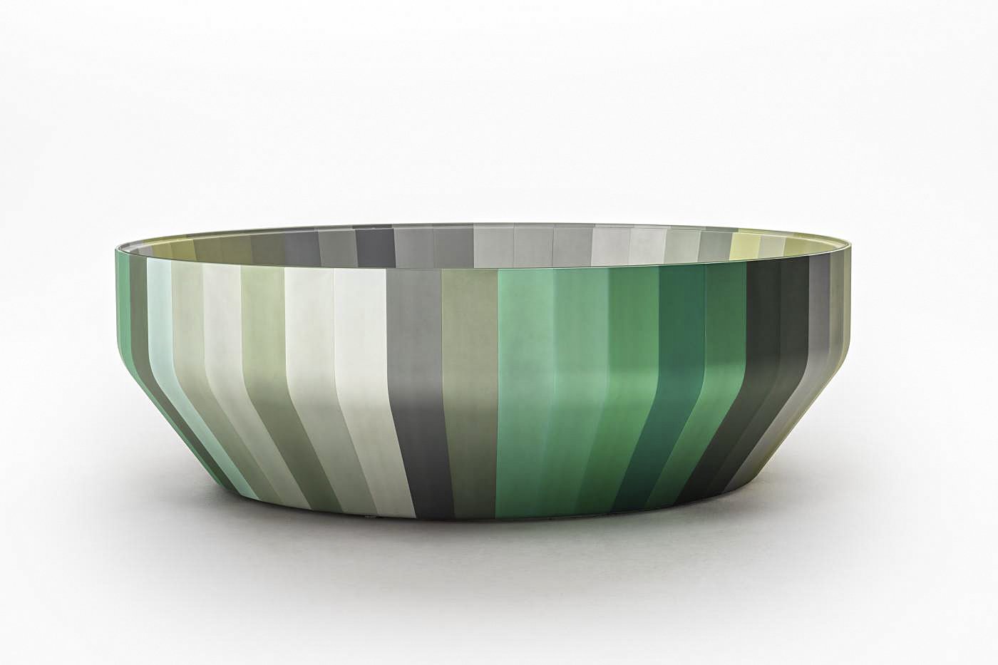 |
The Iris series interprets the color wheel in a three-dimensional form. |
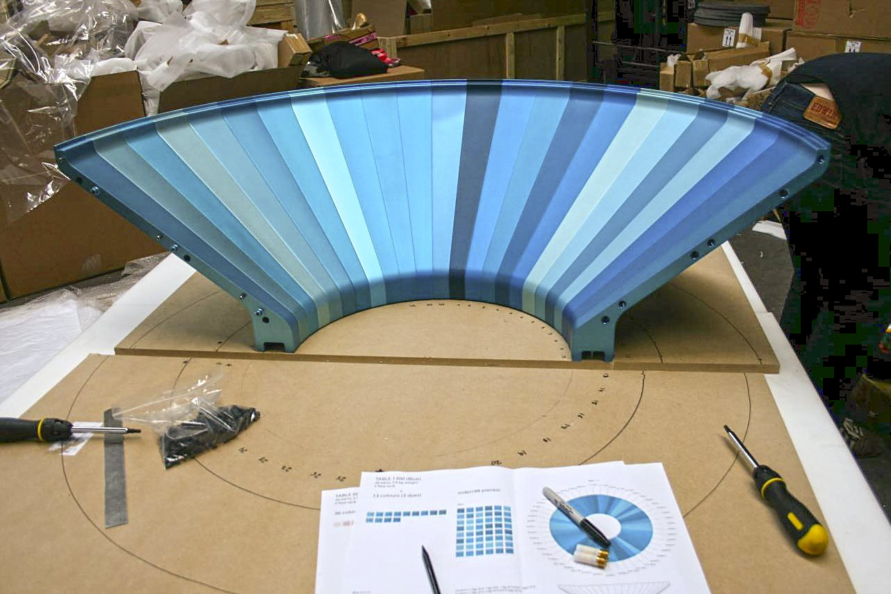
Iris debuted in 2008. In this series of five tables from Edward Barber and Jay Osgerby, the simplicity of the appearance — a ring of colored aluminum segments topped with transparent glass — hides the complex design process. To create Iris, the pair researched combinations of colors, tessellating a single geometric form into the outline of a circle. Fabricators machined the design in solid aluminum; another plant anodized each aluminum strip in the colors specified by the designers.
Designers Edward Barber and Jay Osgerby founded their design studio, Barber Osgerby, in 1996. The acclaimed design duo created the torch for the opening ceremony at the 2012 London Olympics, as well as large-scale installations at London’s Royal Academy of Arts and Victoria and Albert Museum.
 |
| 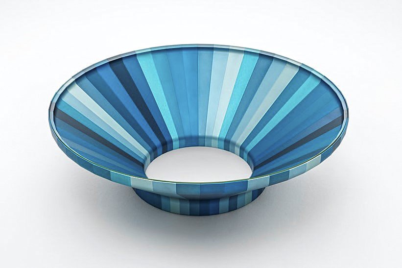 |
Top, left: Here, Iris 1300 is assembled by hand. Top, right: Iris 1200 is styled near a window to catch the light. Middle: Iris 1500 at the line’s gallery launch. Bottom, left: Iris 500’s cylindrical silhouette. Bottom, right: Each Iris table is topped with glass to reveal the colors within. |
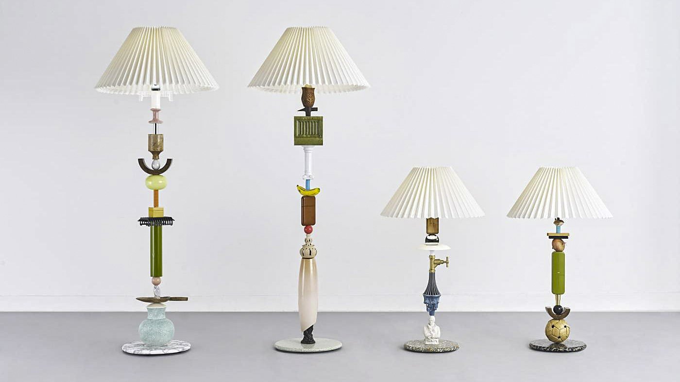 |
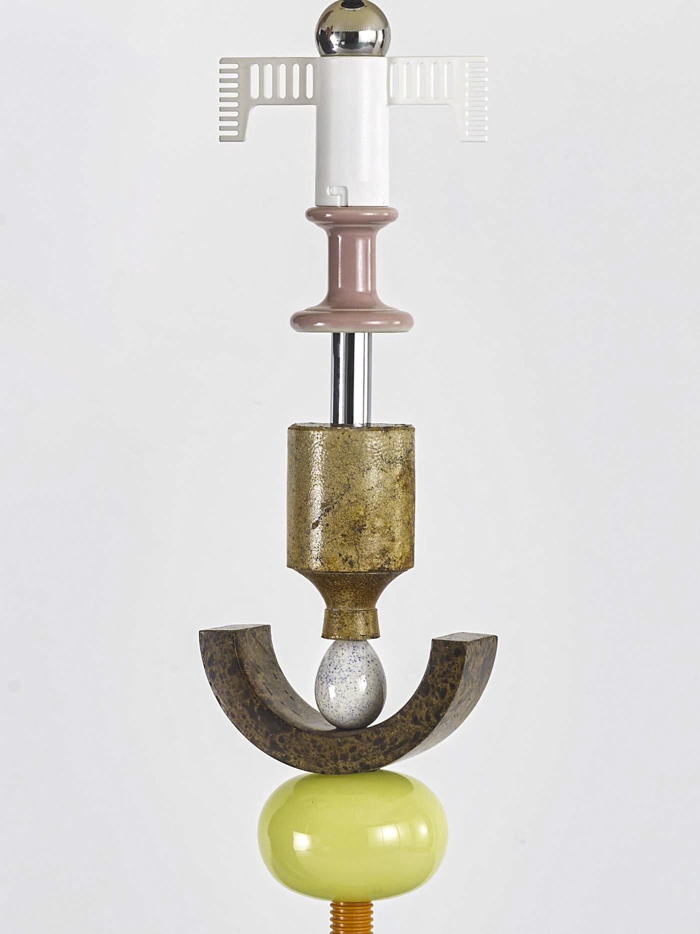
The latest set of Kebab lamps, designed in 2020. |
Originally launched in 2010, Committee designers Clara Page and Harry Richardson began redesigning their Kebab Lamp Series in 2020. Due to the lengthy creation process, Page and Richardson only craft eight lamps per year. New pieces include two table lamps and two floor lamps, each assembled from eclectic objects discovered at antique shops and flea markets around London. Inspired by human relationships with commodities, the designers stack playful finds such as a ceramic owl, wood trowel, and plumbing hardware to create artistic skewers laden with symbolism. Polished stone bases and classic pleated lampshades offset the amusing aesthetic of the body.
Top: Details from the Nest lamp. Bottom, left: The Out of the Blue floor lamp. Bottom, right: A close-up of the Thought table lamp. |
 |
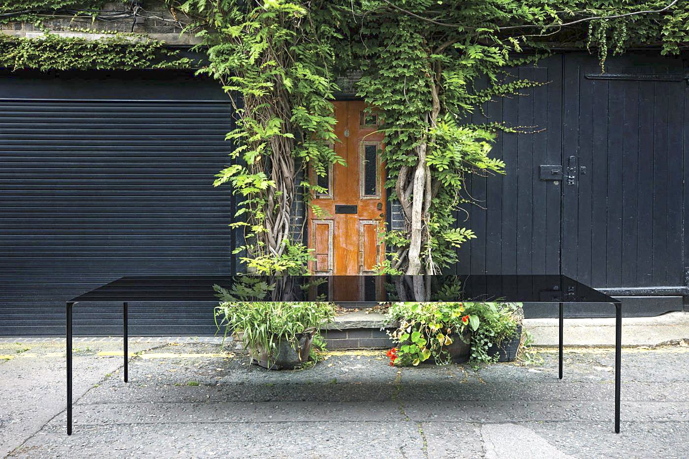
Designer Terence Woodgate and Formula One engineer John Barnard collaborated on the design of the Surface Table. |
For the Surface Table, industrial designer Terence Woodgate collaborated with Formula One engineer John Barnard. Using aerospace and racecar technology, Woodgate and Barnard explored the potential applications of carbon fiber to design a balanced table with an almost impossibly thin, two-millimeter-deep surface. The table consists of nearly one million carbon fiber strands cured under high pressure and temperature. Sleek tapered steel legs complement the substantial length of the table. “We were interested in taking the form of a normal table, one with legs at each corner, as far as we possibly could,” says Woodgate. “It became a search for perfection. Radius corners, round legs, domed feet and rounded edges all accentuate the slimness of the design, making the entire form a seamless blended geometric surface.”
The Surface is available as a coffee table, desk, console, or dining table in natural carbon finish.
Top: The minimalist design of the table helps it to suit a variety of environments. Bottom, left: A steel leg meets the carbon-fiber tabletop. Bottom, right: Woodgate and Barnard also designed a chair to match the table. |
 |
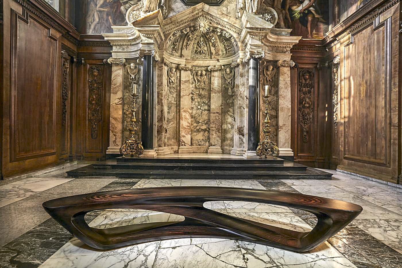
A beechwood version of the Drift bench |
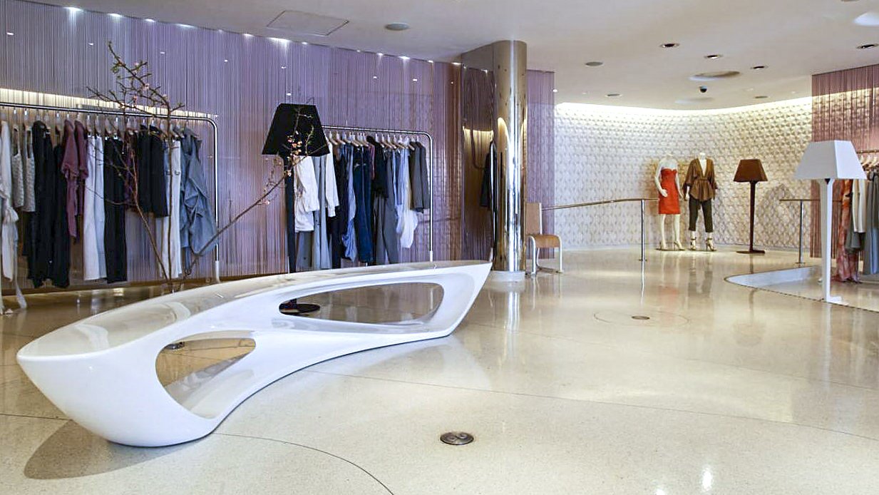
British architect Amanda Levete creates biomorphic designs merging technology-driven materials and processes with natural forms. Her Drift bench demonstrates this aesthetic. Inspired by weathered driftwood, the bench features meandering curves and angles that focus attention on negative space. Clients can order the Drift in hand-carved beechwood; it is also available in matte or high-gloss glass fiber customizable in the full range of Pantone colors.
Levete is the recipient of the Stirling Prize, one of the top architecture honors in England. Her work includes the Selfridges Building in Birmingham, England — a career-defining masterpiece of aluminum discs resembling chainmail — and the expansion at the Victoria and Albert Museum in London.
 |
Top: The Drift’s sculpted silhouette has a life-like quality. Middle, left: The Drift-In Drift-Out L1390. Middle, right: The Drift bench in concrete. Bottom: The white Drift in a Stella McCartney boutique in New York. |
 |
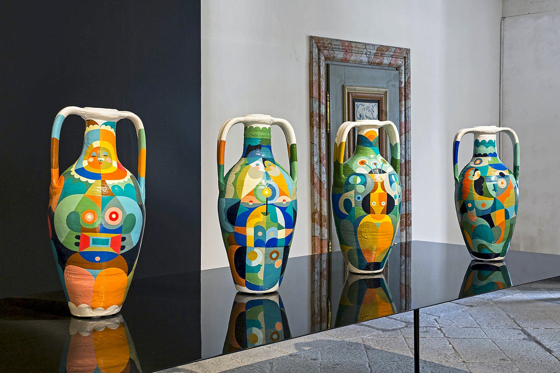
Four vases by Liselotte Watkins for Limited Edition by Established and Sons. |
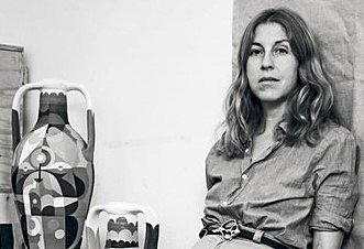
Swedish artist Liselotte Watkins designed a series of colorful hand-painted vases for Established and Sons. Known in the fashion world for recent collaborations with Prada and Marimekko, Watkins has spent the last several years living in Italy, where she began to collect vintage and antique amphorae that she discovers in local shops. She paints figures and geometric shapes directly onto the urns. Echoing the creations of Niki de Saint Phalle, her work celebrates bold expression, elegant linework, and femininity. “I love that her pieces are warm and unashamedly decorative, and yet have a lot of associations to historical aesthetics in art,” says Wrong. “She is drawing from futurism and modernism, but she reinterprets these elements in a contemporary way.”
An unfinished urn in the studio. Right: The Trinitá vase. |
SHOP ESTABLISHED & SONS ON INCOLLECT
.jpg)





_0.jpg)

