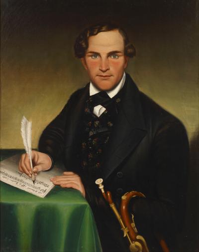


Miami Art Dealer Robert Funk Refocuses Attention on Classically Trained Artists
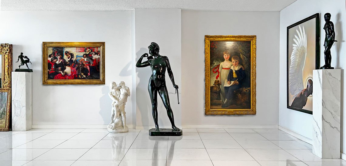 |
| A gallery view at Robert Funk Fine Art, Miami, Florida. |
Miami Art Dealer Robert Funk Refocuses Attention on Classically Trained Artists
By Benjamin Genocchio
Incollect sat down with the veteran Miami art dealer to find out how art is finding its way into the interior design orbit in Florida and beyond.
 |
Fairfield Porter (1907–1975), Marina Scene, circa 1960s. Watercolor and pencil on white wove paper, 14.5 x 22.75 in. Property from the estate of Anne E. C. Porter, with the estate stamp, verso. |
Incollect: You have an interesting and diverse art world background starting first as an artist. What made you move into art dealing?
Early in life, I received rigorous academic art training from my father, a commercial artist who studied at the Art Students League with Frank Vincent DuMond and George B. Bridgman. Furthering my art education at Ithaca College in 1970, I was inspired to view the visual world in new ways by my two art professors, Robert Richenburg and Salvatore Grippi. Both were first-generation abstract expressionist painters and made abstract art as early as the late 1940s. As their student, it was only natural that I would give abstract painting a go. I was prolific at doing abstract painting and sculpture. I experimented with large textual canvases dotted with thick globs of paint. With other paintings, I floated raw pigment on top of liquid tar, yielding dreamy marbleizing effects. I crafted paintings composed only of different colored feathers.
Minimalist sculpture consumed me as well. I constructed a 30-foot-long grid of identical open brown paper bags lined in vertical and horizontal rows. As light skimmed its surface, intriguing shifting shapes revealed themselves.
Given my personal experience as a creator and having an understanding of the arc of the history of abstract art from the late 1940s to its culmination in the 1950s to mid-1960s — it’s my belief these days that anyone doing abstract painting after the mid-1960s is likely to be a derivative artist unless the work is done in a very original and masterful way.
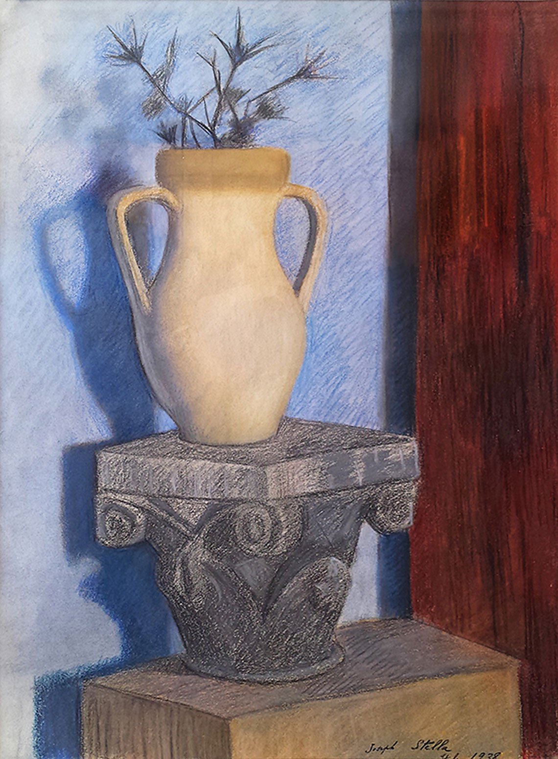 |  | |
Left: Joseph Stella (1877–1946), Thistles, 1938. Pastel on paper, 25.75 x 18.75 in. “Artistically, Stella is making a statement about the interaction of shapes and forms. At first glance, it appears that his color scheme is somewhat restrictive with the use of gray-blues, grays, and ochres. However, in person, there is a richness, depth, and understated saturation to these colors. This is in counterpoint to the alizarin crimson wood panel that forms a vertical on the right of the composition.” Right: Francis Luis Mora (1874–1940), Mother and Child, circa 1920s. Oil on board, 15.5 x 11.5 in. “This warm portrait looks like it could have been painted by Corot. Notice the artist's distinctive use of chiaroscuro, with subtle contrasts between light and shade. It's marvelously composed with positive and negative spaces balancing the overall composition.” | ||
What attracts you as a dealer?
As an art dealer in 2024, I am attracted to artists with traditional academic training. They must have good concepts and execute them in a complex, personal way. In a nutshell, I like artists who have a style. Today, the art world is dominated by ultra-contemporary art. As a result, great paintings by highly skilled artists have been pushed out of the limelight. Great examples by more traditional artists are widely available and should be passionately sought after. They are overlooked and undervalued.
 |
Francis Luis Mora (1874–1940), Spanish Souvenir, 1926. Oil on canvas, 36.25 x 48 in. “F. Luis Mora was the first Hispanic member of the National Academy of Design. This is a museum-quality work and it used to hang in the Palace of the Legion of Honor in San Francisco.” |
Describe the feeling you have when you see a great painting.
Initially, I have an emotional response when viewing an artist’s work. If joy ripples through my body, I know I have a keeper. Sadly, that seldom happens when I view contemporary art. It does happen when I view some traditional artworks. I get an emotional response and an intellectual response. One of America’s first Hispanic artists, Francis Luis Mora, delivers both for me with his work Spanish Souvenirs, from circa 1926. It is masterfully painted and communicates a spirit of traditional elegance and joy. The disposition of the figures relates harmoniously to each other and the surroundings. I can marvel at its lusciously expressive paint application for hours.
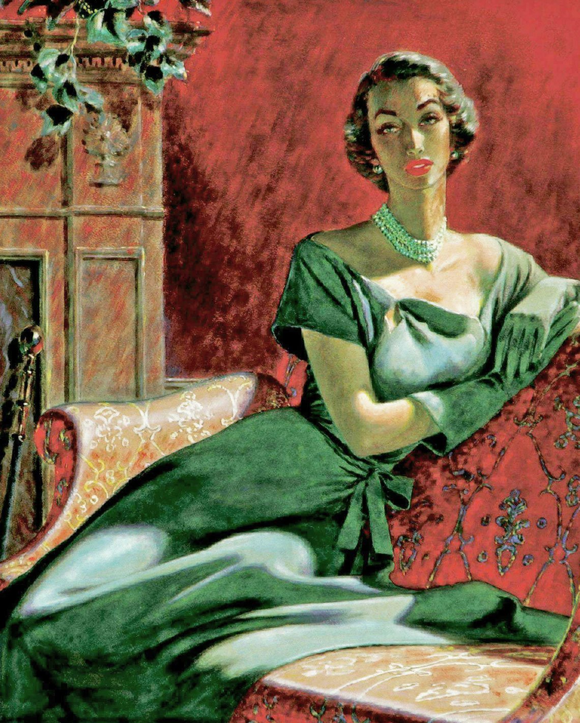 | 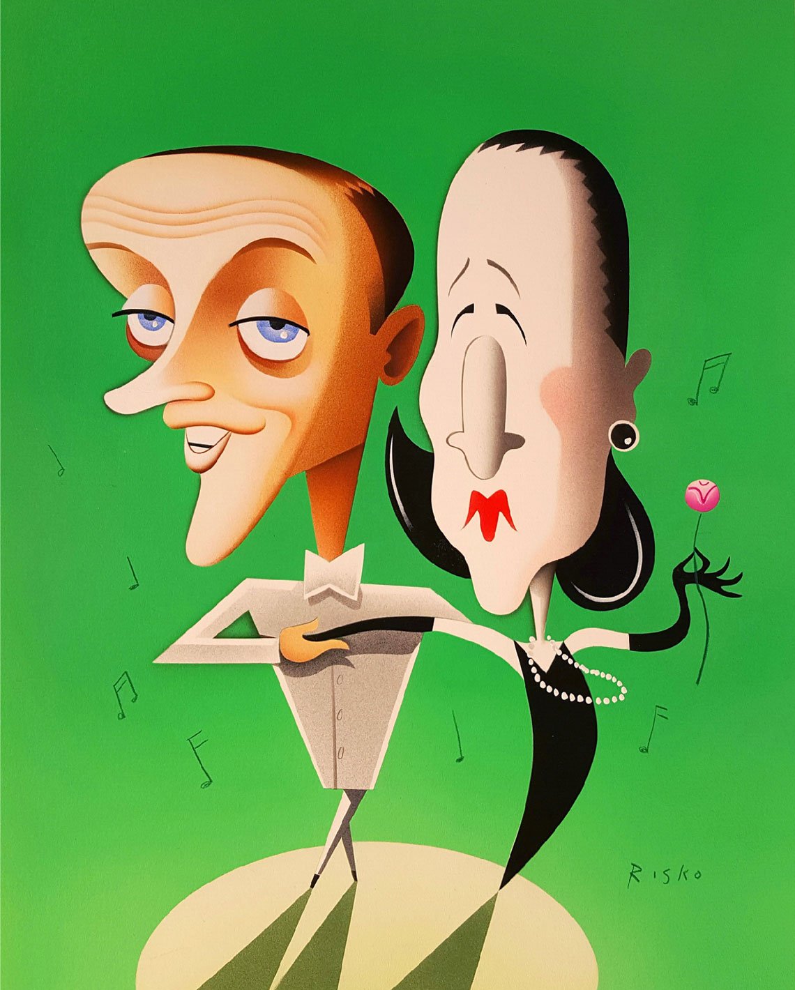 | |
Left: Edwin Georgi (1896–1964), Portrait of a Woman, circa 1950s. Mixed media on board, 20.34 x 17.25 in. Illustration for Redbook magazine. Work is unframed. Right: Robert Risko (b. 1956), Fred Astaire and Diana Vreeland, circa 1980. Airbrush illustration on paper, 19 x 14.5 in. Published in Vanity Fair magazine. | ||
What excites you right now?
At Robert Funk Fine Art LLC, I have many artists who punch above their art historical weight but fall below the contemporary art world’s radar. I am also working on a new wider project, “Women Illustrators of the Golden Age.” Contrary to popular perception, women were gainfully employed as illustrators as early as the late 19th century. Women’s magazines were the central way to disseminate information to women. The magazines hired women to do the visuals that told great stories that aroused the viewer’s emotions. Important careers in art history were born. Ground-breaking artists/illustrators such as Jessie Willcox Smith, Elizabeth Shippen Green, and Helen Dryden became household names and role models in their day. Their art stands the test of time and they have laid the groundwork for future female artists interested in academic art.
 |
John Philip Falter (1910–1982), Father and Children in Front of TV, circa 1950s. Oil on canvas, 17 x 24 in. “John Falter arranges figures and faces in a way that rivals the old masters in their compositional perfection. And he makes it look easy. The expressions are captured so the emotions of the story come alive. This Golden Age of illustration artist depicts fathers and children watching cartoons during the golden age of television. The appeal of this work lies in Falter's ability to convey the emotions of the sitters to the viewer. Most likely an illustration for the Saturday Evening Post, McCall's, Life magazine, or Look, or an ad for one of his blue chip corporate clients.” |
 |
Dean Cornwell (1892–1960), He Lay Face Down, 1936. Oil on canvas, 34 x 40 in. Published in Cosmopolitan magazine to illustrate “The Short Happy Life of Francis Macomber,” a short story by Ernest Hemingway. “There exists no living artist today who can paint and draw on a level as Dean Cornwell. Cornwell was Norman Rockwell’s favorite illustrator and an icon of the “Golden Age of Illustration.’ He produced oils for Cosmopolitan, Redbook, True, American Weekly, Life, Good Housekeeping, and ad contracts for GM, Eastern Airlines, Pennsylvania Railroad, Paul Jones Whiskey, Aunt Jemima, Seagram's Gin, Woodbury Soap, Palmolive, Coke, Goodyear, New York Life and Squibb Pharmaceuticals.” |
What is your take on the relationship between the commercial art world of advertising and commerce and the so-called fine art world?
Advertising and commercial art fundamentally differ from “gallery art” because the artist is not working for himself. He/she is working for someone else. Commercial art is a team effort, with art directors and editors passing judgment. Moreover, as a former advertising agency art director, I have found that commercial artists have far superior academic skills and more profound knowledge of the formal aspects of creating a picture: the design, composition, color, and how to render shape and form to illustrate a story. The downside of commercial art today is that selling the client's message in an overly cluttered environment may diminish the artfulness of the work. This differed with the great artists/ illustrators of the Golden Age of Illustration. Dean Cornwell, Jesse Wilcox Smith, Elizabeth Shippen Green and Bob Peak had editors who knew that artful illustration not only captured the viewer's attention but also drove the narrative. Sadly, virtually no artists alive today can paint and draw as well as those mentioned above. They do not exist because there is no one to teach them. Additionally, the illustration market has disappeared as print media has disappeared.
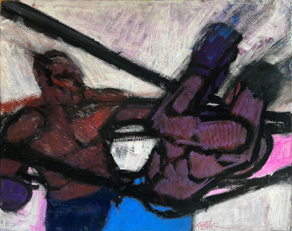 |
Robert (Bob) Peak (1927–1992), Boxer Knockout Punch, 1961. Acrylic on heavy gesso panel, 24 x 30 in. Published in Esquire magazine. “Brilliant American illustrator Bob Peak captures the fury and power of a punch to the face with rapid broad strokes of the brush. Combined with a somber color scheme and gestural brushwork, this painting could be compared to the action painting of Abstract Expressionist Franz Kline, whose quick and wide black rudimentary brushstrokes defined a new era in Modern Art. Unlike Kline, Peak remains rooted in figurative art, but clearly, Peak in 1961 was aware of and pays homage to Kline.” |
You have almost half a century of experience in the art world. What is the most important thing you tell new collectors and why?
Don’t be tricked by the shiny object. Avoid the imitators. Look for enduring appeal. Look for artists who have an irrepressible curiosity and a conviction to innovate. Look for artists who have found their voice and have their own style.
Do you work with architects, or interior decorators on projects for homes or commercial spaces, and if so can you tell us about some projects?
Absolutely. The first thing is to listen and understand what the client is looking for. An artwork placed in a home is, in a sense, a family member. “Mr. de Kooning, welcome to our family. It will be a pleasure having you stay with us.” Since art is a visual experience, we offer to insert paintings into photographs of a client's space digitally. The client can see how it looks in situ, and the artwork will ultimately sell itself.
What is on the walls in your own home?
I have more art than walls. Rotating paintings and sculptures frequently provides me with fresh input. I am also influenced by a groundbreaking book on design psychology, Some Place Like Home: Using Design Psychology to Create Ideal Places, by Toby Israel, Ph.D. The book’s premise is that one’s past place experiences and emotions, especially in childhood, unconsciously influence our sense of taste and style. It’s true! As a child, I grew up with a father who was an artist, and he surrounded us with more art than walls.
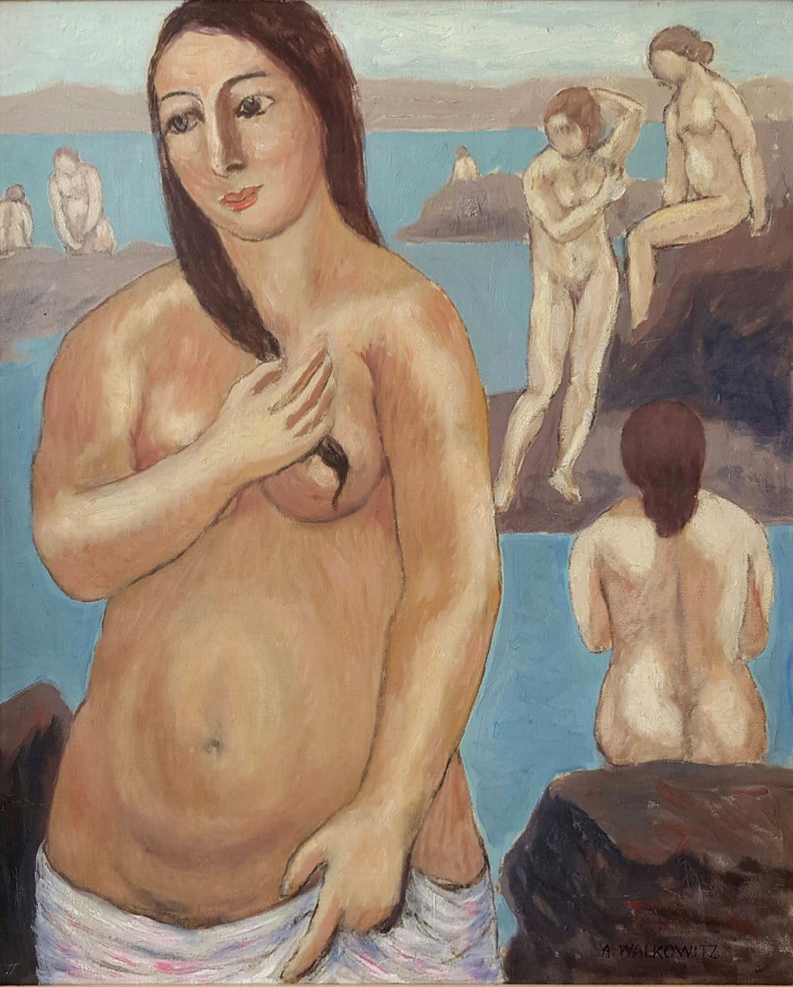 | 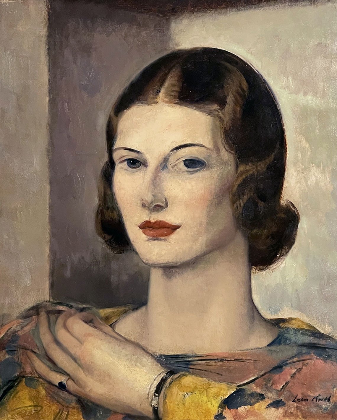 | |
Left: Abraham Walkowitz (1878–1965), Nude with Pink Towel, 1920. Oil on canvas, 30 x 25 in. Right: Leon Abraham Kroll (1884–1974), Portrait of an Elegant Young Woman, circa 1930s. Oil on canvas, 18 x 15 in. | ||
Is color something you gravitate towards? Why is color important in art?
Color beckons and engages the viewer due to its emotive qualities. In some cases, the color itself is the subject.
How does having art on the walls of a home or a commercial space alter the experience of a space?
Art brings life to space. It elevates the viewer's mood and energy and raises one’s intellectual awareness. Art has been around since the dawn of mankind.
What percentage of buyers come through the internet versus people just walking through the door these days?
The online experience now has an almost ubiquitous worldwide reach. Combined with the advances in cell phone technology and ease of use, buying online art is becoming dominant.
 |
Wilson Bigaud (1931–2010), Haitian Couple in Bed Simultaneously Adjusting their Radios, circa 1960s. Oil on board, 15.75 x 30 in. “Wilson Bigaud was an idea artist who showcased visual ideas in many of his paintings. In this work, a married Haitian couple tunes their radios in sync as they lie in bed. Bigaud was greatly interested in radios, which appeared in many of his works. This work rises to the level of Surrealism in that Bigaud is doing more than just depicting a normal bedroom moment. There is something very strange and bizarre in the couple's synchronized actions.” |
How has the art scene changed in Miami in the years you have been there? Are there more collectors now?
Miami is an ascendant city. Cranes dot the skyline everywhere. Much of the influx is from the northeast, but Miami is essentially a Latin city. As wealthy South and Central Americans move here, they seek primarily Latin and Caribbean art to grace their walls.
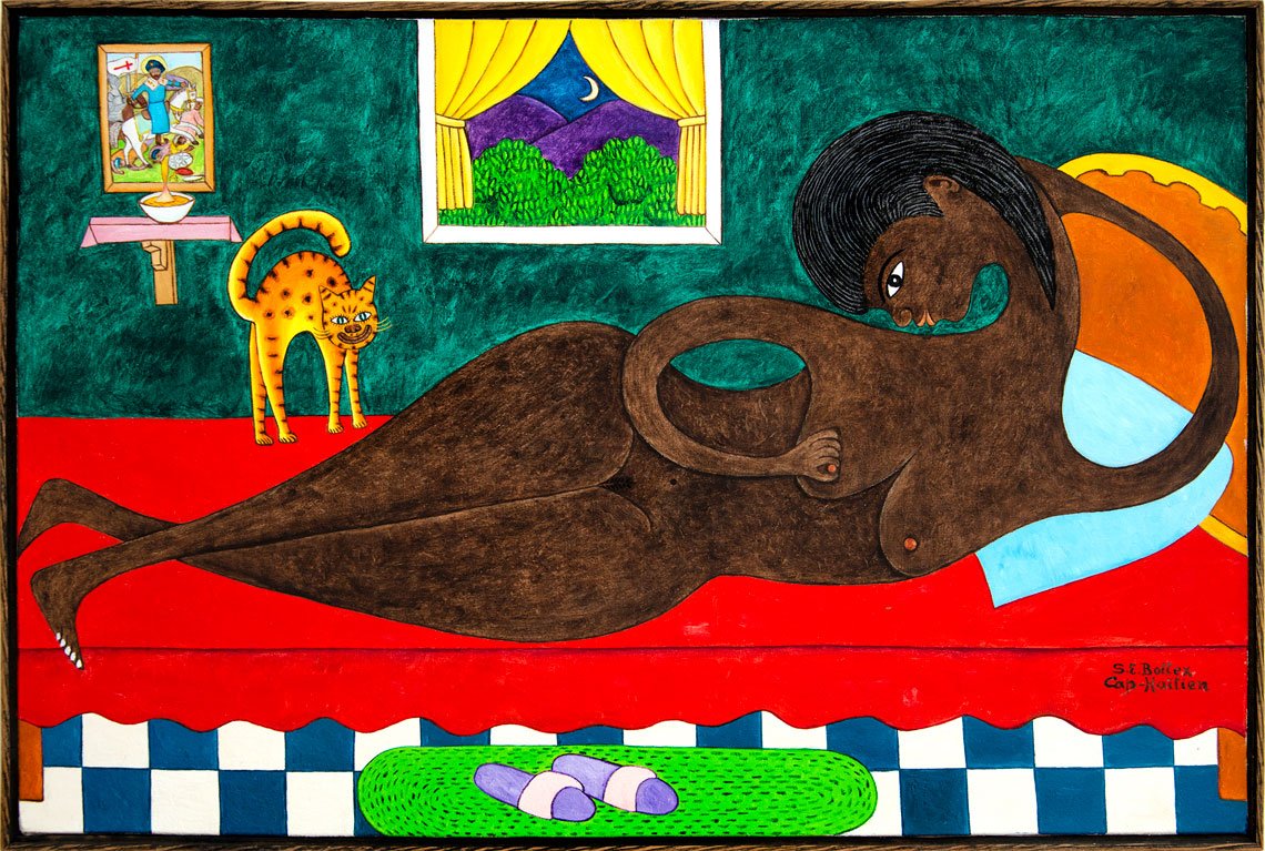 |
Seymour Etienne Bottex (1922–2016), Sensuous Reclining Nude with Interested Cat, circa 1960s–70s. Oil on canvas, framed, 25 x 36 in. “Strong colors and a perfect interaction of positive and negative spaces along with its large size make this a powerfully involved work. Seymour Etienne Bottex is one of Haiti's most outstanding naïf painters.” |
What are your thoughts on art as an investment?
In the cool light of reason, I point to the current de-dollarization and inflation trends; some US clients are moving away from paper currency and migrating to hard assets. Art is getting a strong second look as a place to park money. Art embodies several properties. One, it has the potential to be a good investment — like gold or spirits. Two, it can nourish one's aesthetic needs. Thirdly, art is a great conversation piece and an intellectual stimulant.
 |